Redesign effort for Spiceworks’ flagship software product
Spiceworks’ first product was a free onsite IT help desk application. Launched in the mid-’00s with little change to the UI since, it looked and felt a bit outdated. When Spiceworks decided to build a cloud version of the app, I was given an opportunity to rethink the UI.
What we were working with
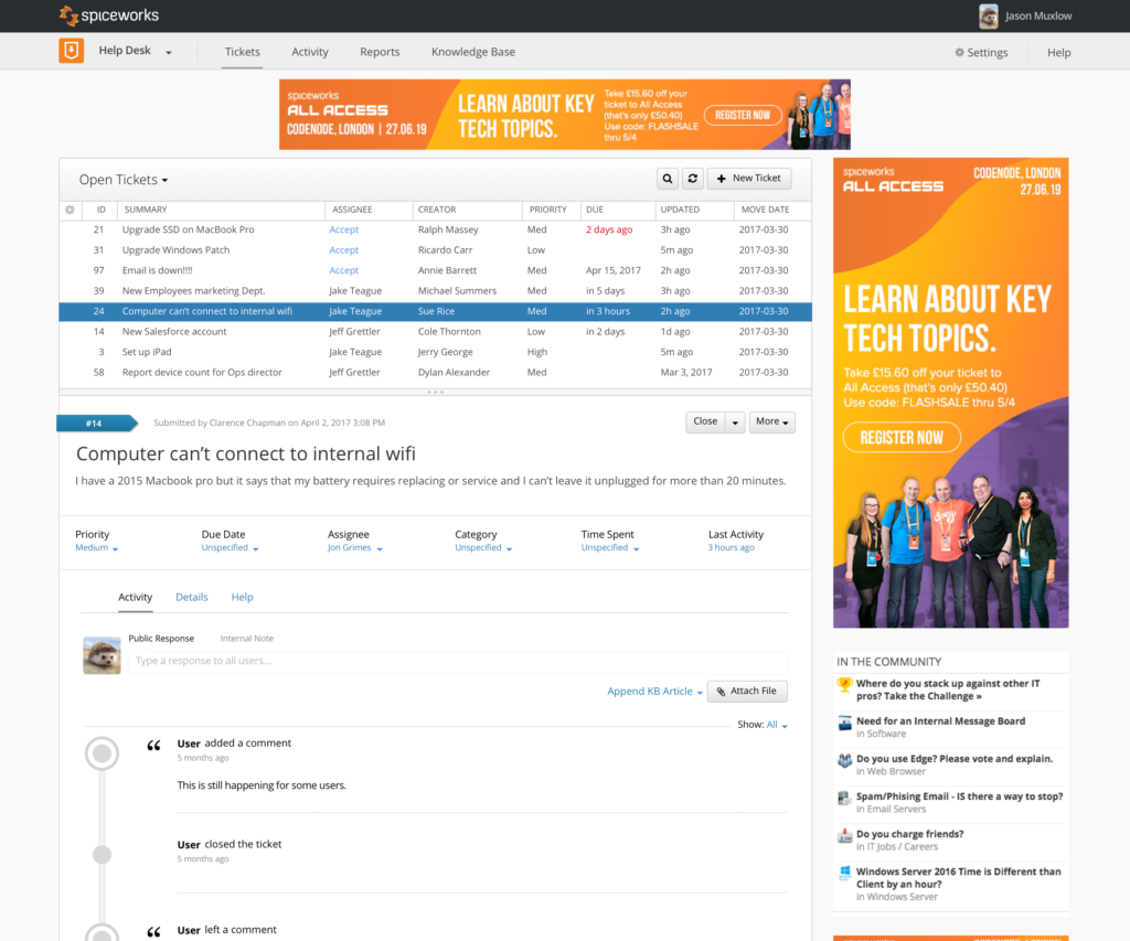
Help Desk was a list & editor application, stacked vertically a’la old-school email clients, with ads on the top and side.

Problems to solve
Some issues were apparent just by looking:
- The top banner ad disconnects the app from its navigation; Google Analytics showed little activity on the other tabs, possibly because users didn’t realize they were there
- The stacked, vertical layout pushes the most important content down the page, potentially below the fold
- User has to choose between a large view of tickets queue or a large editor, adjusting the divider manually if they want to change it
- Vertical layout doesn’t take advantage of widescreen monitor real estate
- One could argue that a rotatable monitor solves the problem, but we didn’t want to require special hardware for the best software UX.
Additional UX challenges
- Making a clear distinction between messaging with the end user and updating the ticket
- Balancing too much and too little information
- IT pros are a notoriously crusty lot; overworked and underpaid, it’s not uncommon for them to start seeing the end users they support as a nuisance instead of their client
Process
- Conducted interviews with our internal IT staff
- Built high fidelity mockups to test ideas with the design team
- We worked exclusively in hi-fi at Spiceworks (no wireframes), so I built a number of reusable Sketch libraries to speed things up and made them available for our team to share, expand and update as things changed
- Built paper prototypes & conducted usability testing with internal IT staff
Solutions

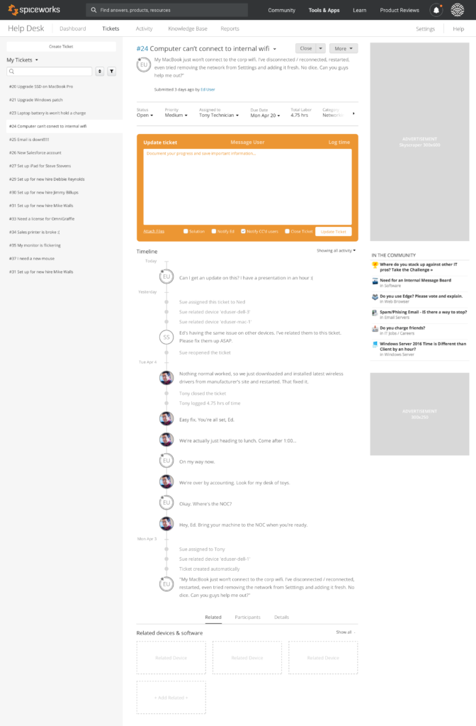
The biggest change was the move to a horizontal layout, which everyone wanted. It gives the user a more complete view of the tickets in their queue, and the most important ticket information at the top of the UI.
Design caught a bit of luck when the product owner allowed us to remove the top banner. Everyone acknowledged the problem it caused, and it wasn’t as important to the bottom line as it used to be. With the top banner ad removed, the UI is more connected to the overall application navigation (white “Help Desk” toolbar).
The center column is where the user does most of their work:
- The large orange block is the center of user activity for the user, where they update tickets, message end users, and log their time
- The timeline retains all the transactional logging of the previous version, but in a more subdued fashion, emphasizing the human interactions and updates
- Filters — applied throughout the current session and saved for the next one — allowed an IT pro to simplify their timeline further.
- Efforts were also made to simplify time-tracking.
The right column with ads and links to lure users over the Community forums (these two audiences didn’t mingle as much as we wanted them to) remained as-is.